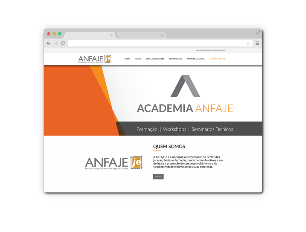
Anfaje Academy
2018 - Anfaje
Keeping the chromatic references of the association brand, and giving the symbol greater prominence, we sought, through its shape, an evident stylization of the letter "A", the similarity to an open book, while at the same time referring to the indication of a path, a hat that welcomes the knowledge that the academy proposes to communicate.